First, big thanks to Ronen for the opportunity to write a making of for the blog and sharing my work on the blog's Facebook Fan Page. (citation from ronenbekerman)
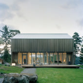
In this article I’m going to describe how I've put this project together using 3dsmax, V-Ray and Photoshop. I have always been a fan of minimalistic and clean structures, and this Swedish Barn I found online back in 2011 was exactly that.
I liked the approach and the treatment done on the wood by painting it with something called Iron sulfate to get a gray look which almost makes it disappear in this type of environment when you look at it from a distance. That is probably why I gave it a shot in the first place.
I started to model this one back in 2011, but for some reason it went into the freezer for 3 years. I stumbled upon it on my hard-drive recently and thought about giving it one more go… so here we are.
The name of this house is #001 by Arkitekthus, and I think the first one was built in 2006. They are into creating great PREFAB architecture their clients can enjoy from, with high quality at a great price.
Claesson Koivisto Rune architecture office was commissioned to develop the House #001 concept for Arkitekthus. Considering the client has the opportunity to change some kind of materials, I took the same liberty and changed some minor things from the original design.
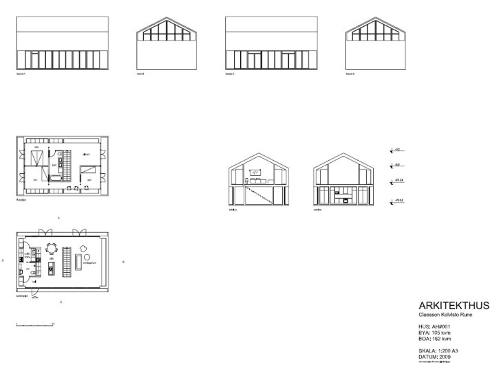
I aimed at making both exterior and interiors for this project, and the first thing I did was visiting Arkitekthus website to get some architectural drawings and references to make the 3dsmax modeling of the base mesh as easy and informed as possible.
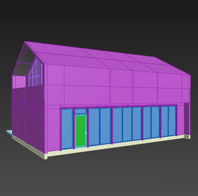
For the modeling of the wood cladded facade, I used the well known Floor Generator script. I used the same width for all the wall boards, but did allow for randomness in the length of the boards by setting different min and max values for it.
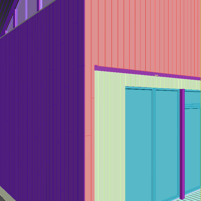
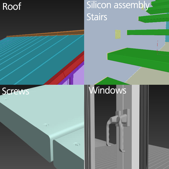
I payed attention to the details regardless of visibility in the final output when doing a personal project. I'm relaxed knowing I can always dive in closer or look at the house from every angle possible. Here, I did all the screws for the floorboards even though I went for winter image with snow covering that detail.
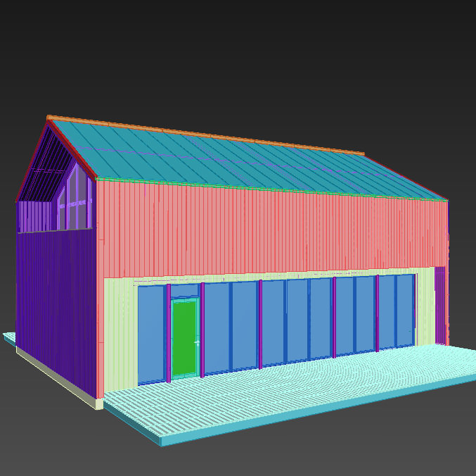
For the snow on the ground I've created a plane and then started to sculpt it with 3dsmax sculpt tool from the ribbon. Snow has this tendency of accumulating next to objects, like in the case of the terrace bottom so I brushed some more at these parts.
When I was happy with the ground shape I took a screenshot and went inside Photoshop and started to paint with some random scatter grunge brushes on these parts where the environment can have made the biggest impact on the snow.
To the right, in my image, there is a grass field so I almost left it like it is, just made some minor scattering strokes with low opacity to get a little structure.
For the little road to the left I used 2 different shoe prints. I've considered something like one adult and one child maybe have been walking there.
For the terrace I did something different. I placed the snow 3mm beneath the terrace surface and then displaced the snow up over the wood instead of using opacity maps. This way I had the control in Photoshop to do whatever I liked, footsteps to the door and minor snow beneath the outdoor furniture. Same technique goes for the roof. Where I want the snow I paint white and leave the rest black.
The rocks were created with Rock Generator and SnowFlow for the snow on top of them.
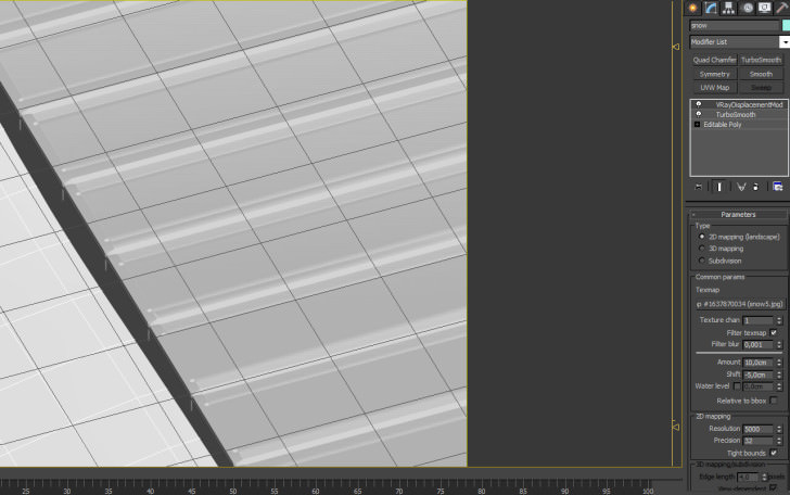
One thing I learned during the process that I will try to implement in the future is to try and break this field into several objects because my ground texture went up to 20,000px wide.
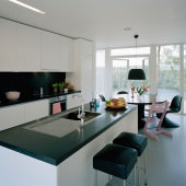
Most of the interior elements are modeled with 3dsmax using just basic poly modelling or spline-techniques such as lathe or sweep.
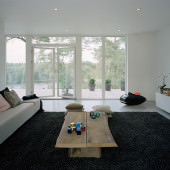
For pillows I used Marvelous Designer with an inner pillow for the basic pillow shape and then draped these with some cloth to get more realistic wrinkles.
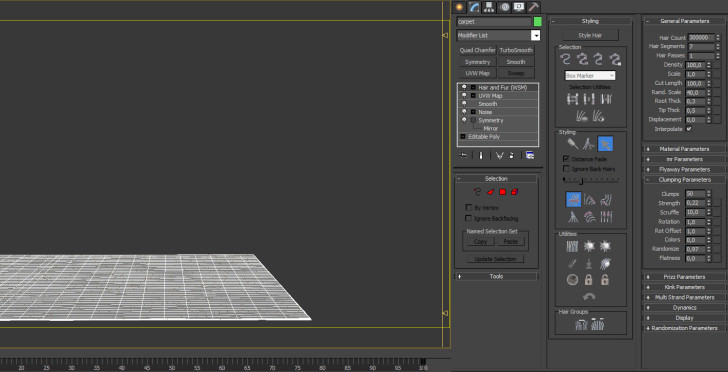
The Rugs is created with 3dsmax hair and fur, I often think that scattering a few straws isn't the best choice because carpets often tends to create several clumps which I believe is hard to have control over inside a scatter solution.
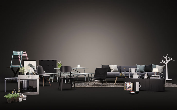
Way back in time I did some research for prints and poster and visited a site called luxoliving in Denmark. They had all these really nice prints from the Danish designer Kristina Krogh which I used in the scene.
I did the organic vegetation such as olive trees and basil in kitchen with GrowFX. I modeled and made a few different variation of leaf sizes, proportions and veins. This is the only way to get it correct. Smaller leaf have a different shape and weight so it’s very important to not use same textures and models for all the leaves.
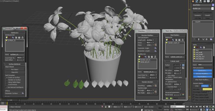
I must say that I actually spent most time modelling the Sony A7R camera of all props, just because It was really fun to take some extra time for it.

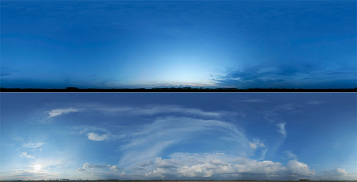
From the beginning I had this plan to make blue hour for the exterior and overcast / blue hour for interiors. So it was never a tough decision to make, just sticking to the plan.
I’m trying to have a pretty lighten scene when doing the setup of the main light situation, it’s just easier to tweak things that way.
I used image based lighting setup with an HDRI inside a V-Ray Domelight for the environment in all images and for the interior light I used IES lights and V-Ray Light Planes.
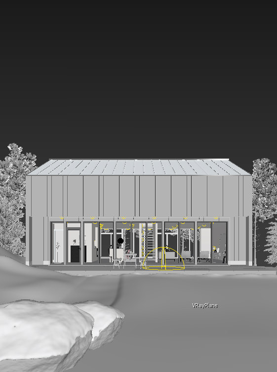
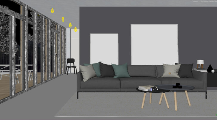
My snow shader is pretty simple and it worked out fine for me so why complicate it. The material is just a non-refractive material with diffuse from the displacement map and little reflection and some smoke for the fine bump / crystal effect.
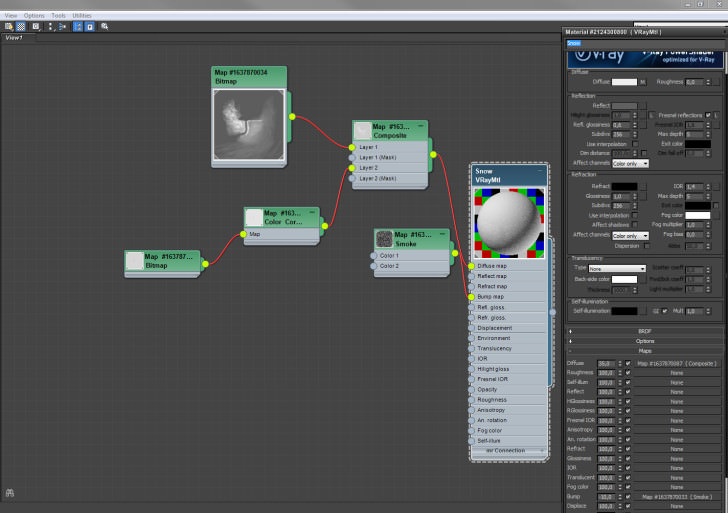
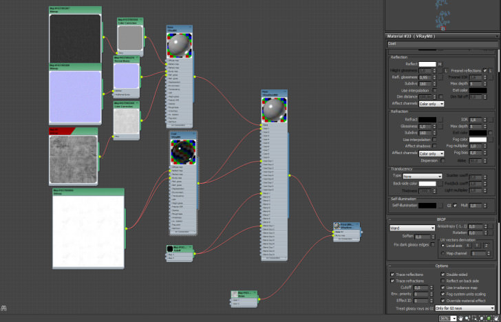
I created many of my materials in this project with a VRayBlendMtl for a more realistic approach. Small dirt, micro scratches and different glossy values for the reflective approach angles is some of the things I want to achieve with a material. Just like it works in the real life, but at the same time it’s very important to not overdo it. Many people add too much dirt or use glossiness maps with very high contrast which leads to a result that can’t be seen in the real world.
158FLARES
Nothing special or ground-breaking here. This is just how I like to work things out.
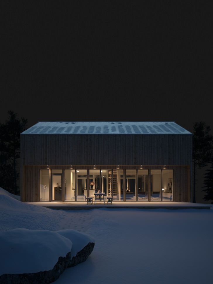
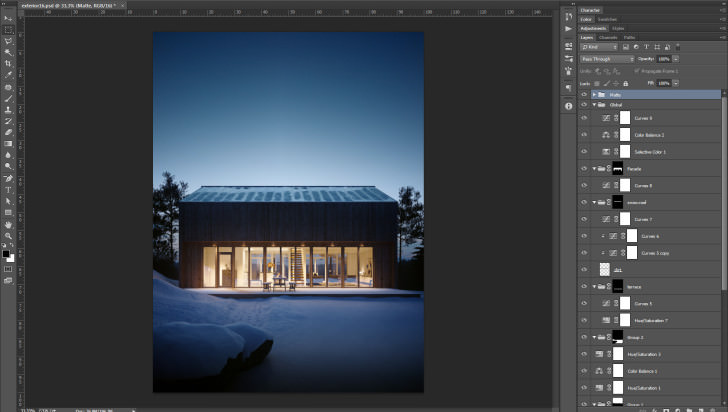
First, I try to find a good balance between all elements in a 32 bit comp inside Photoshop. I often add the sky here even though it’s just a 16 bit image.
For the horizon I thought it was very important for the composition to see it through the house. Inside 3dsmax the camera horizon line is a lot higher. But the interior inside would look very boring without it so I went for a lower horizon.
The 32 bit mode in Photoshop is still quite limited even though it is 2014! So I do what I can do with it – exposure, levels, hue saturation, brushing, multiplying, subtracting and so on. If I need curves I just open magic bullet looks and do the curves on that specific part I want to change so it’s never a real issue, but I would like to have a non destructive comp in the future.
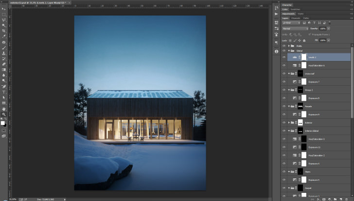
Next part is to convert it to 16 bit and start to use apply more tweaks that I like such as color balance, selective color and curves.
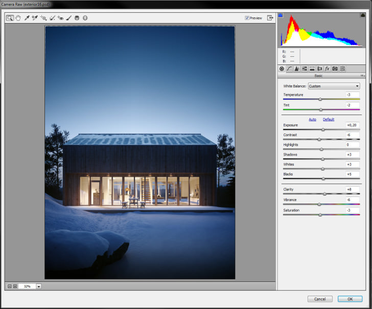
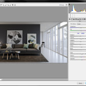
And for the final part, I use camera raw inside Photoshop to make the last minor tweaks, maybe some more contrast, a little brighter blacks and so on.
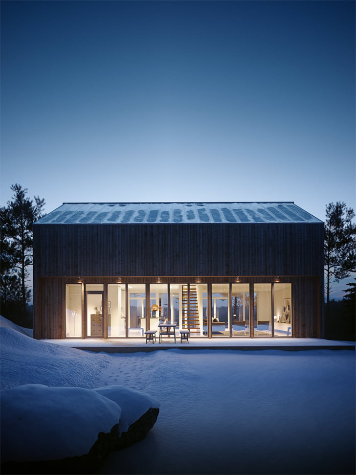
And this is the final image :
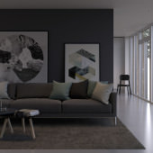
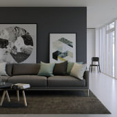
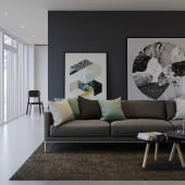
The same workflow goes for the interior images. See images below for the process from living room raw render / 32bit / 16bit / Final. For some reason I like a mirrored composition better so for the final image it is mirrored.
Hope you find it all somewhat useful 
Regards,
Victor.

So beautiful scene of the house these are. Furniture is also good. But there should be a spinning variety as i saw when purshsed by using Luxo Living Coupon Code from the couponscrane.
ReplyDelete